Showing posts with label logo. Show all posts

Tuesday, June 24, 2014

From The Desk Of Pamela J. Bates

Northbound Knitting Branding

I've been banging away at a ton of branding design for the last year working with clients as varied as a wine consultants, skin spas, a children's boutique and everything in between. I've been quite remiss in sharing some of this work with you and thought it was high time I at least began to catch you up on that front.

When I was approached by Lisa Mutch of Northbound Knitting to design a new logo and collateral to better reflect her brand, I was excited as soon as I took a look at her shop. It's gorgeous, and so are her products. Northbound Knitting has a modern, clean aesthetic; is really well put together, and has grown into quite a success. In fact when Lisa launches her new dyed yarn batches from her studio in Barre, Ontario, Canada, they often sell out in a matter of hours if they last that long. Due to this fact, many of her customers pre-order her hand dyed yarns. Her yarns are stunning and have deep color quality to them, thanks to the color-fast acid dyes she uses. Lisa also has a booming business in great part to her knitting patterns, many featuring simple geometric lines.

We took inspiration from all of that, as well as her market and where she envisions her business going as it continues to grow.

I created two initial design concepts.  The initial design Lisa chose to move forward with, was a play on her business initials- NBK, an abbreviated version of her business name which is how Lisa and a majority of her clients refer to her business.

This is how it began.


The simple, clean, straight forward lines of this logo really appeal to me.


There were only minor revisions needed for us to get to the final logo, which is one of my favorites that I've designed so far.


 Here's the final branding board for NBK.


It was a pleasure to work with Lisa who was an excellent communicator about her business, her needs, and her desires, right from the get go.

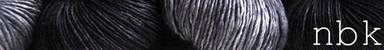
Lisa began incorporating her new logo and collateral into her Northbound Knitting marketing right away, from a new shop header to new business cards and hang tags for her products, as well as social media pages

When I get a response like this from a client, I know I've done something right.

"I'm so excited!! Your work is amazing, I can't wait to slap this logo all over!! I will also be having it tattooed on my forearm, hahaha!"

I don't think Lisa's gotten the tattoo yet, but you get the picture.


What have you been working on lately?

Make it a great day, it's a great day to have.

Ciao for now,


Tuesday, March 11, 2014

From The Desk Of Pamela J. Bates: In The Mood

Setting The Tone


Hi guys. Today I'd like to tell you a little bit more about my logo design process. Something that I neglected to include in my recent 'how a logo is created' posts 'Part 1' and 'Part 2', was creating a moodboard.  I'd like to backtrack for a moment, if I may..............

When I work with a client on custom logo design or branding collateral design, I send them a creative style brief questionnaire. As you guessed by the name, it has a lot of questions for my clients to answer.  All are aimed at giving me better insight regarding a client's needs, a good understanding of their business and their market, the benefits their product/service provides to customers, their business belief system, as well as a their style likes and dislikes. Once I receive the creative style brief questionnaire back from my clients, I think it is important to speak with them and review their answers. I find that there are some things that come out through conversation that aren't always unearthed by the questionnaire, and they can be important to the design direction of their project. Plus, call me old fashioned, but I think it is a good thing to have a person to person conversation.  Email is great, but it's not always a replacement for a phone call or face to face meeting.  Inflections and tones can be misread in an email and having a conversation can help to avoid that.

As I  move from the creative brief review, I'm generally sketching and collecting ideas for their custom logo design.  If my clients have pinterest accounts, we connect there so we can look at visual examples of things that we both think speak to the direction a design should take.  If not, they will send me images they've collected, or links to things that speak to them.  These examples are are not always literal. It's more about mood, shapes, colors, and tone. That's where a moodboard comes in. It's one more point of reference for me as I work on logo and branding collateral design.

One of my current clients, is Northbound Knitting


Owner Lisa Mutch is located up north in Ontario, Canada and has successfully built a great following and a niche market for herself.  Her shop is very representative of the style she wants to convey to her market. Her vision is clear, but Lisa knew it was time to rebrand her business so that her logo better reflected that same vision and style. She continues to increase her business' foothold and is ready to take it to the next level with a new logo that will support her market reach and future growth. 

The moodboard that I created for the Northbound Knitting project is all about sharp/clean lines, shapes within shapes, the entire gamut gray hues, angular motifs, and a modern, slightly edgy sensibility. Plus some.


------------------------------------------------------------------------------------------------------------
stoneware bowls:michael graydon for herriot & grace / coffee table: west elm
hand-dyed yarn and patterns: northbound knitting / arora borealis ring: hybrid handmade
atlantic ocean: pamela j. bates/the muse / geometric line art: jeele martens
studio mister: overlapping transparent squares
------------------------------------------------------------------------------------------------------------

The thing with moodboards is that there aren't really any rules.  They're about feel, texture, color, shape, tone, and so much more. They speak to a business' market, and product or service.  They're a visual representation of a client's creative style brief and our collaborative review.  It wraps their style and direction up in a collage of sorts, that becomes one more piece in the design process.

As a designer it's important for me to use all the tools at my disposal to create a solid foundation for the design work to be done, and moodboards do just that.

One thing I really love about moodboards, is that they are as varied as my clients, their businesses, and their projects. 

If you have any questions about the design process, feel free to ask. After 20 years of working with small business owners on their visual and written marketing/advertising/pr efforts, I've had a lot of experience with a large variety of clients, projects, and situations. If I can help one of you with things that I've learned along the way, that's great. So, shoot.

Make it a great day in your corner of the world and I'll do the same.

Ciao for now,


Tuesday, July 30, 2013

From The Desk Of Pamela J. Bates


Part of The Process

One of the things I am currently working on is a logo design for lovely woman, Markana Jordan, who is launching her own event planning and consulting business.  She has taste, she has style, peppered with a little sass and humor. Now the trick is pulling that all together in her logo.

I've presented Markana with her first initial designs, we've talked and gone over what she likes, what she doesn't like. This is an important step in the process. It is not often that designers, myself included, get things perfect on the first go. It's more of a dance bewteen designer and client, or even a blind date leads to a second date where we get to know each other a little better.

Here's some of the inspiration, starting with her signature. Our concern there, is that her name is unusual and must be legible because it will be the focus of her business branding.


Sources: Saloon logo by Oat Creative, linen napkins via Washington Post; all other images Bates Mercantile Co.

The first round of design included the bottom logo that made us of the M & J from Markana's first and last names.  We both like the initials but the rest is perhaps a bit too 'stiff' for Markana's personality.

So the process continues and the logo evolves, moving us toward the logo that will say everything she wants it to say about her and her business.

Have I told you lately that I love my job?

I also have to run off and ship prints to various places today. Knowing my artwork will hang in someone's space somewhere else in the world, also makes me happy.

What are you working on today? Is it making you happy?

Ciao for now,


Thursday, July 18, 2013

From The Desk Of Pamela J. Bates

Logo Design: Dalton Lane Portrait Co.

I've had the pleasure of working with some really wonderful people lately, a good majority of them young women business owners.  I just love that.

One of them in particular is Jessica of Dalton Lane Portrait Co.

You'd never guess it by looking at her work, but Jessica just picked up a camera three years ago! Say what?

Her husband was deployed in Iraq and she was home with their two little ones. When she got the news that her husband Jessi would be part of the biggest troop movement in history, from Iraq to Afghanastan, Jessica was watching the news every night trying to get a glimpse of him. She thought, if one picture could mean this much to me, a photograph must mean the same to others.

Jessica found me via our etsy shop, Bates Mercantile Co., and I'm so glad she did. She'd already tried a multitude of logos, but was striking out. None were truly what she wanted them to say about her business or where she wanted her business to go. She wanted a mix of Classic Americana, with a hint of Irish in the form of a shamrock, since her studio loft/home is located on N. Irish Street.

It doesn't happen often, but she loved one of the first initial drafts I presented to her. She honestly couldn't believe it. Neither could her husband. Jessica told me she'd been through too many logos to even count and was just beside herself that I was able to design something that really spoke to her on the first go round. 

The only thing we really changed other minor tweaking, was the color. She'd been thinking about navy and red, but had just finished painting the studio organic gray and wanted it all to be cohesive.

This is where we ended up.


When I get messages like this from my clients - " I LOVE it. LOVE, LOVE, LOVE it." - it sure does make my day.

I LOVE, LOVE, LOVE my job and working with people like Jessica.

I am currently finalizing a logo for another young business owner in Indiana.  Lo and behold, it's another design that worked out on the first go round.  I'll be sharing that with you soon.

Beyond that, there is a mad gang of neighboorhoodlum marauders in the pool out back.  Neighbors Sandee and Gerry just jumped in with their grandchildren. Glad somebody is swimming around in this heat!

What's happening in your world?

Have a fantastic day.

Ciao for now,


Related Posts Plugin for WordPress, Blogger...