
Hi guys. Today I'd like to tell you a little bit more about my logo design process. Something that I neglected to include in my recent 'how a logo is created' posts 'Part 1' and 'Part 2', was creating a moodboard. I'd like to backtrack for a moment, if I may..............
When I work with a client on custom logo design or branding collateral design, I send them a creative style brief questionnaire. As you guessed by the name, it has a lot of questions for my clients to answer. All are aimed at giving me better insight regarding a client's needs, a good understanding of their business and their market, the benefits their product/service provides to customers, their business belief system, as well as a their style likes and dislikes. Once I receive the creative style brief questionnaire back from my clients, I think it is important to speak with them and review their answers. I find that there are some things that come out through conversation that aren't always unearthed by the questionnaire, and they can be important to the design direction of their project. Plus, call me old fashioned, but I think it is a good thing to have a person to person conversation. Email is great, but it's not always a replacement for a phone call or face to face meeting. Inflections and tones can be misread in an email and having a conversation can help to avoid that.
As I move from the creative brief review, I'm generally sketching and collecting ideas for their custom logo design. If my clients have pinterest accounts, we connect there so we can look at visual examples of things that we both think speak to the direction a design should take. If not, they will send me images they've collected, or links to things that speak to them. These examples are are not always literal. It's more about mood, shapes, colors, and tone. That's where a moodboard comes in. It's one more point of reference for me as I work on logo and branding collateral design.
One of my current clients, is Northbound Knitting.
Owner Lisa Mutch is located up north in Ontario, Canada and has successfully built a great following and a niche market for herself. Her shop is very representative of the style she wants to convey to her market. Her vision is clear, but Lisa knew it was time to rebrand her business so that her logo better reflected that same vision and style. She continues to increase her business' foothold and is ready to take it to the next level with a new logo that will support her market reach and future growth.
The moodboard that I created for the Northbound Knitting project is all about sharp/clean lines, shapes within shapes, the entire gamut gray hues, angular motifs, and a modern, slightly edgy sensibility. Plus some.

------------------------------------------------------------------------------------------------------------
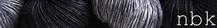
stoneware bowls:michael graydon for herriot & grace / coffee table: west elmhand-dyed yarn and patterns: northbound knitting / arora borealis ring: hybrid handmade
atlantic ocean: pamela j. bates/the muse / geometric line art: jeele martens
studio mister: overlapping transparent squares
------------------------------------------------------------------------------------------------------------
The thing with moodboards is that there aren't really any rules. They're about feel, texture, color, shape, tone, and so much more. They speak to a business' market, and product or service. They're a visual representation of a client's creative style brief and our collaborative review. It wraps their style and direction up in a collage of sorts, that becomes one more piece in the design process.
As a designer it's important for me to use all the tools at my disposal to create a solid foundation for the design work to be done, and moodboards do just that.
One thing I really love about moodboards, is that they are as varied as my clients, their businesses, and their projects.
If you have any questions about the design process, feel free to ask. After 20 years of working with small business owners on their visual and written marketing/advertising/pr efforts, I've had a lot of experience with a large variety of clients, projects, and situations. If I can help one of you with things that I've learned along the way, that's great. So, shoot.
Make it a great day in your corner of the world and I'll do the same.
Ciao for now,


Great moodboard, I love the shapes, colour (or should I say lack of colour because it's mostly greys?) and textures.
ReplyDeleteI do so love all hues of gray. Thanks Marieken!
Deleteshades of grey...so very soft and pretty.
ReplyDeleteDebbi
I think the fact that neutrals go with everything makes them easy to love!
DeleteNice description of proces. and the moodboard, it certainly talks of the 'north'...I am thinking of being rugged up on Scottish highlands, and going into a very modern renaissance/intellectual home,
ReplyDeleteI love insights into the creative process! I made a mood board on Pinterest for my shop before I got too far in the process. It really helps me stay on track and inspires me when I'm feeling stuck. Beautiful collection of colors and shapes!
ReplyDelete