
It’s a gray day here in New Hampshire. I’d prefer sunshine, but at least it means I don’t have to water the vegetable garden or the flower gardens. And, the way a rose holds raindrops on its petals is one thing to cherish about this kind of gray day in June.
 |
| Who can't be happy, despite a gray day, when channeling Julie Andrews in The Sound of Music? |
On the subject of gray, I just love it more and more in all sorts of design. How about these dandelion screen printed napkins by Giardino. So lovely-especially paired with bright yellow to balance its muted effects. Just brilliant.
Copyright Giardino |
 |
Copyright Pamela J. Bates Bates Mercantile Co. |
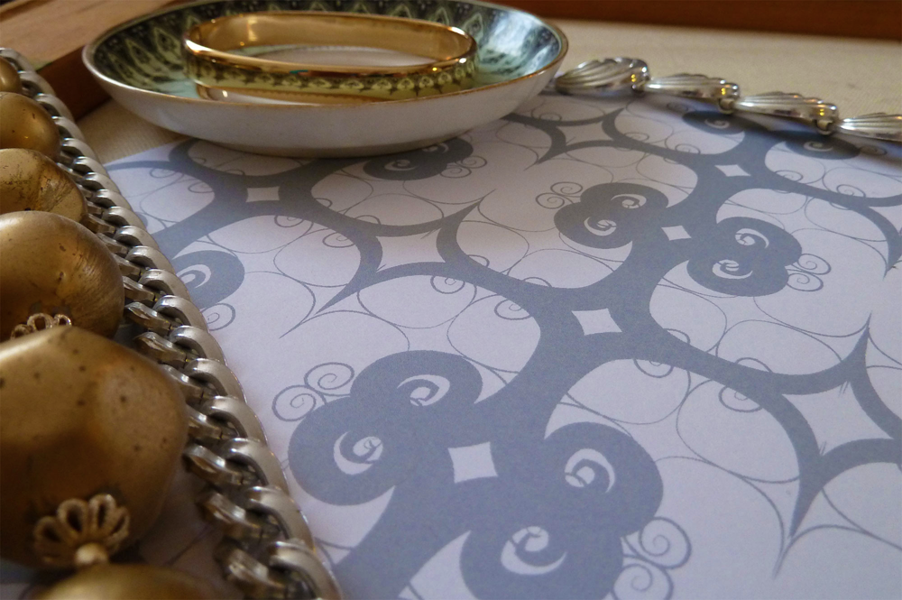
One of my own designs is what I would deem ‘elegantly gray’. My ‘96 Step’s design was inspired by the scrolling ironwork on the terrace of the apartment we stayed in while in Rome a few years back. Sitting on that terrace was simply sublime. A dream-come-true.
 |
Copyright Pamela J. Bates Bates Mercantile Co. |
The 96 Steps to get to the ‘penthouse’ apartment, in roasting Rome September weather, perhaps not. I’m lucky Garrett survived coming up those steps after roaming in the Rome heat for close to two hours (I opted to stay put and deadhead the flowers on the terrace, sip espresso and watch our neighbor hang out her laundry). We did learn from his experience however, to leave with all we needed in the morning and not come back until we were done exploring. My husband's face after that first climb was something similar to this (of course, it may have had something to do with is inability to breathe at that point):
 |
Copyright Pamela J. Bates Bates Mercantile Co. |
But I’ll leave red for another day.
What’s your favorite way to see gray used? Classic style on its own, with another neutral, or with a pop of unexpected color? I’d love to know. I'm not sure I can even pin myself down with a favorite way to use gray, but one of the other reasons I like it is because ‘nothing is black and white’ and gray is the perfect example of that- it’s somewhere in the middle.


